Responsive Web Design: The Non-Negotiable for Your Website in 2024 and Beyond
Introduction
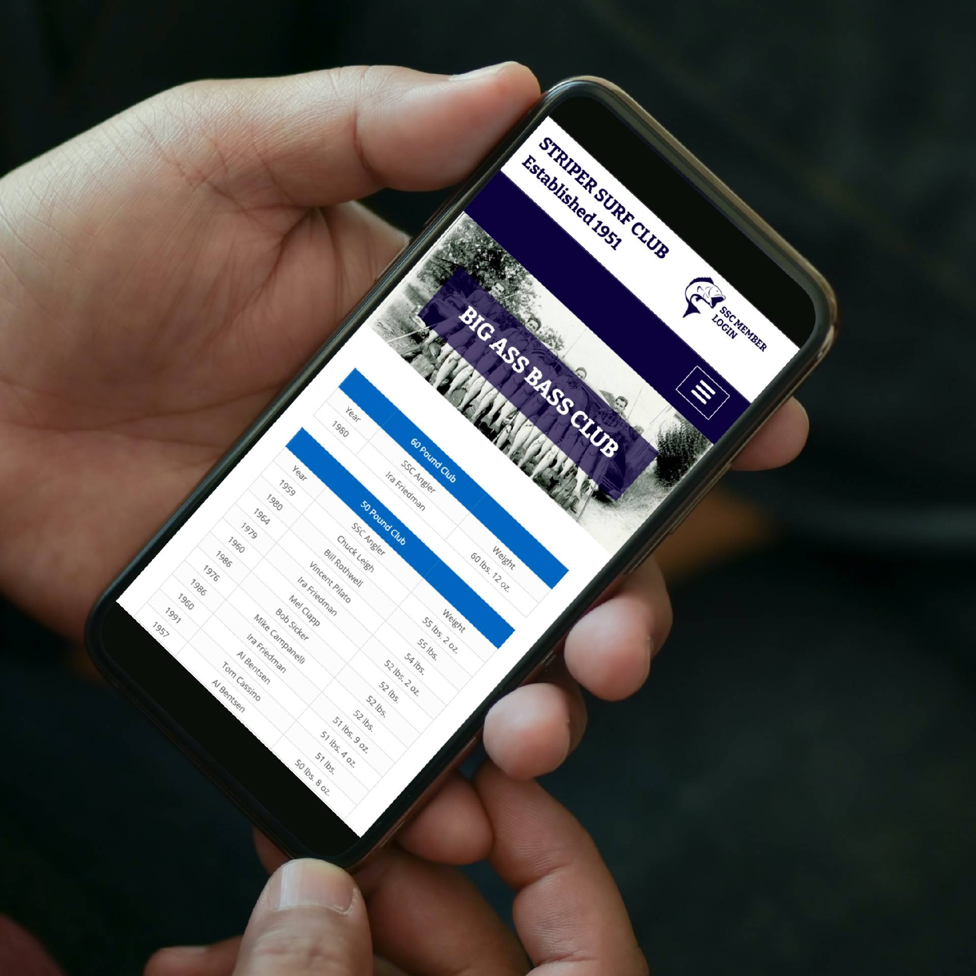
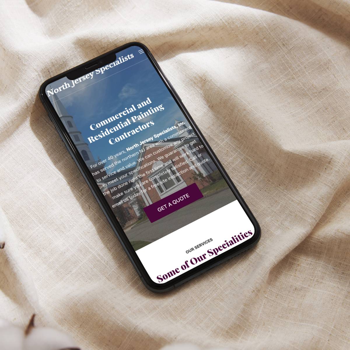
Imagine stumbling upon a website that’s a tangled mess on your phone – tiny text, sideways images, buttons you can’t even tap with precision. Frustrating, right? Now, picture the ease of browsing a site that effortlessly adjusts to your laptop, tablet, or giant TV screen. It’s the difference between a website living in the digital dark ages and one fully prepared for the modern age. This is where responsive web design shines, providing a crucial user experience upgrade and boosting your site’s chances for online success.
What is Responsive Web Design (RWD)?
Responsive web design (RWD) is an approach to building websites that adapt their layout, content, and even navigation to seamlessly fit the screen size of any device visitors use. It’s like having a website that magically rearranges itself based on whether someone’s on a smartphone, tablet, or desktop – with everything clear, readable, and easy to interact with.
Why Responsive Design is a Must-Have
-
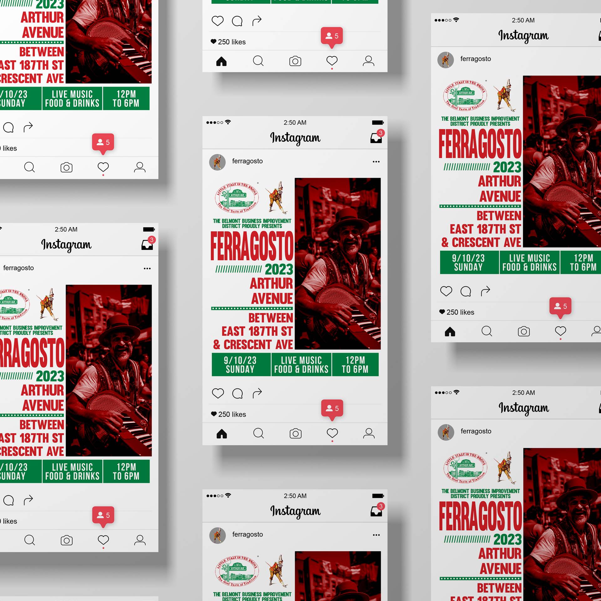
The Multi-Device World: The way we access the internet has changed drastically. It’s not just desktops anymore; we’ve got a dizzying array of smartphones, tablets, smartwatches, and other devices vying for our attention. Websites stuck in the desktop-only era fail badly at providing a good experience on most of these devices.
-
User Experience is King: Clunky navigation, hard-to-read content, and images spilling off the screen frustrate potential customers. RWD keeps everything running smoothly no matter how a visitor arrives. A positive user experience makes people more likely to explore your site, take action, and keep coming back.
-
Google Loves It: Google’s focused on delivering the best possible search results. It ranks mobile-friendly websites higher because most searches nowadays happen on phones and tablets. Responsive websites gain a serious ranking advantage compared to those that fail to adapt.
-
Higher Conversions = More Business: Simply put, a better user experience means more sales, leads, or bookings. Responsive design removes unnecessary friction. When people can browse effortlessly, they’re more likely to become customers.
-
A Single Website to Rule Them All: Remember back in the early 2010s where many websites would have two versions (example.com vs. <invalid URL removed>)? One for computers, one for phones. Not only was it double the headache to develop and maintain, but it fragmented the overall user experience. RWD allows for a single site that effortlessly adapts across all devices.
Beyond the Basics: Responsive Design Benefits
- Brand Consistency: Visitors shouldn’t have two different experiences of your brand based on device. A responsive site guarantees you present a unified, professional image.
- Improved Accessibility: Inclusive design is at the heart of responsive layouts. Content that’s easier to navigate and read is better for everyone, including those with visual impairments or mobility issues.
- Future-Proof Investment: As new devices emerge, websites built without RWD quickly become outdated. Responsively designed sites age gracefully, saving you costly redesigns every few years.
Is Your Website Responsive?
Unsure if your current website stacks up? Here’s a quick test:
- The Resize Test: Open your website on a desktop browser and gradually resize the window smaller. Does everything automatically rearrange itself? If not, that’s a red flag.
- Mobile-Friendly Checker: Google offers a free tool: https://search.google.com/test/mobile-friendly. Paste in your site’s URL and see if it passes the test.
Conclusion
In today’s internet landscape, going without responsive web design is akin to running a race with one foot tied behind your back. Whether building a new site or upgrading an existing one, ensuring RWD is non-negotiable. Responsive design makes for happy visitors, better search rankings, and increased conversions that directly benefit your business. The benefits far outweigh the costs, making it the smartest investment you can make in your website’s future.
Let's Bring Your Vision to Life
Ready to transform your digital presence? Connect with Chris Hurst, a seasoned UX Designer, WordPress Developer, and Front-End Developer. Whether you need an intuitive UX/UI design, a custom WordPress site, or a complete web development solution, I'm here to turn your ideas into stunning digital realities. Let's collaborate and make your project stand out in the digital world.
Start Your Project Today


